Pillar is a business suite for online content creators. This project rethinks navigation to help creators better understand and use the product.
Role
Design lead (product design, information architecture, user research, QA)
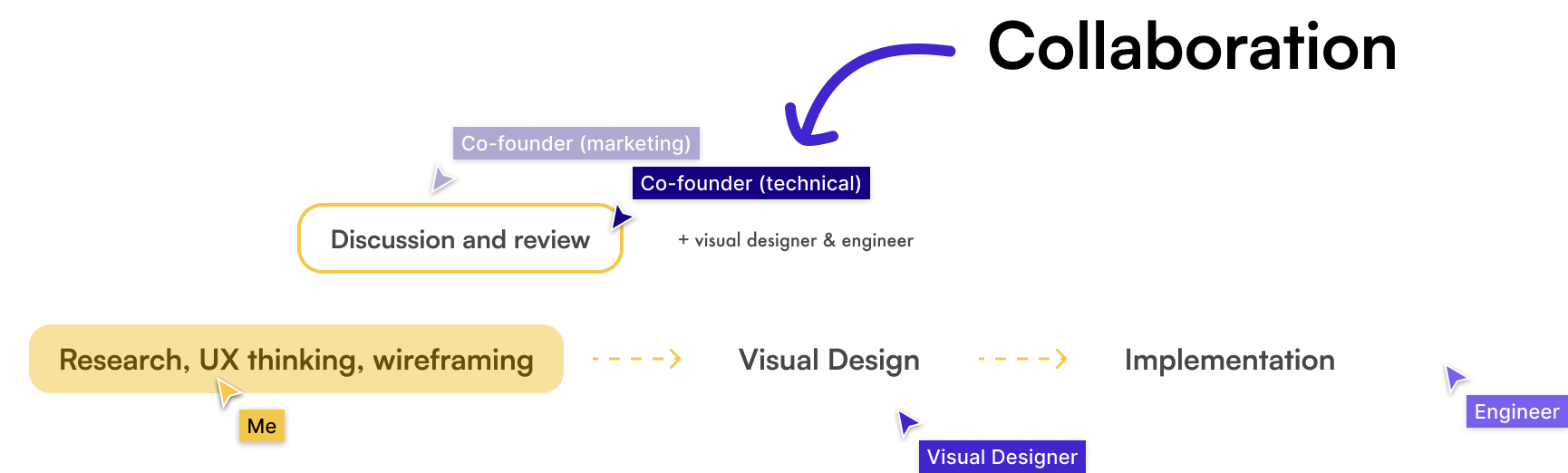
Team
UI designer, engineer, co‑founders
Time
4 weeks (launched July 2022)
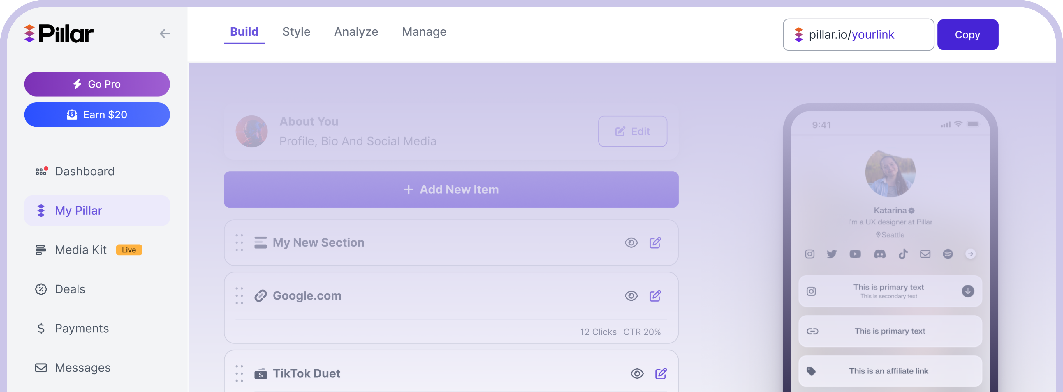
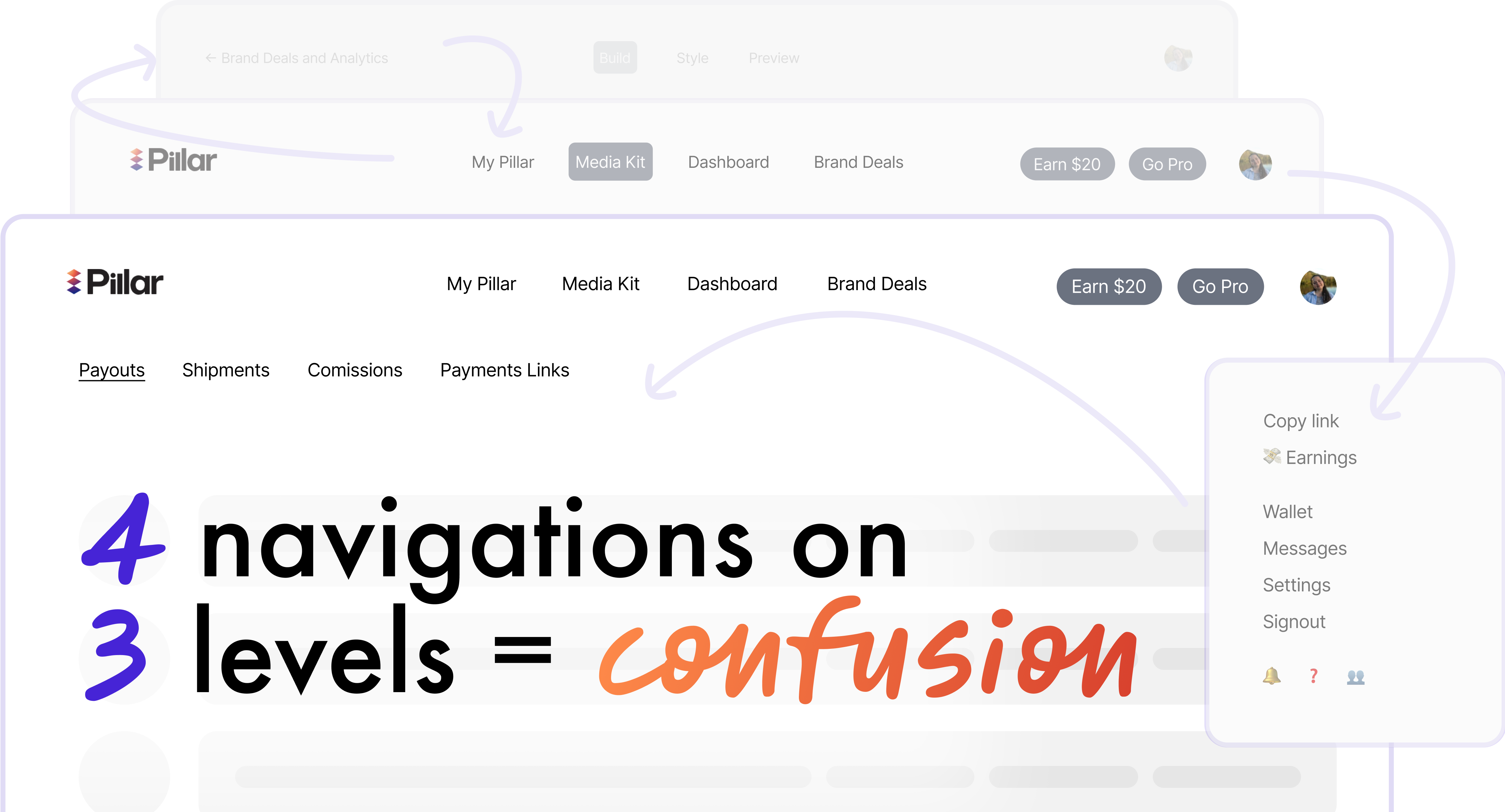
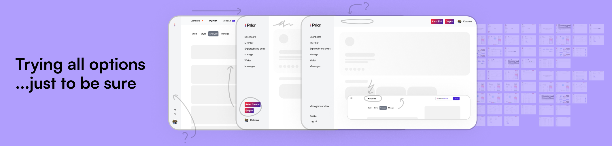
The existing navigation confused users and prevented them from understanding the entire product. It was also incompatible with an upcoming product update and scalable for future additions.
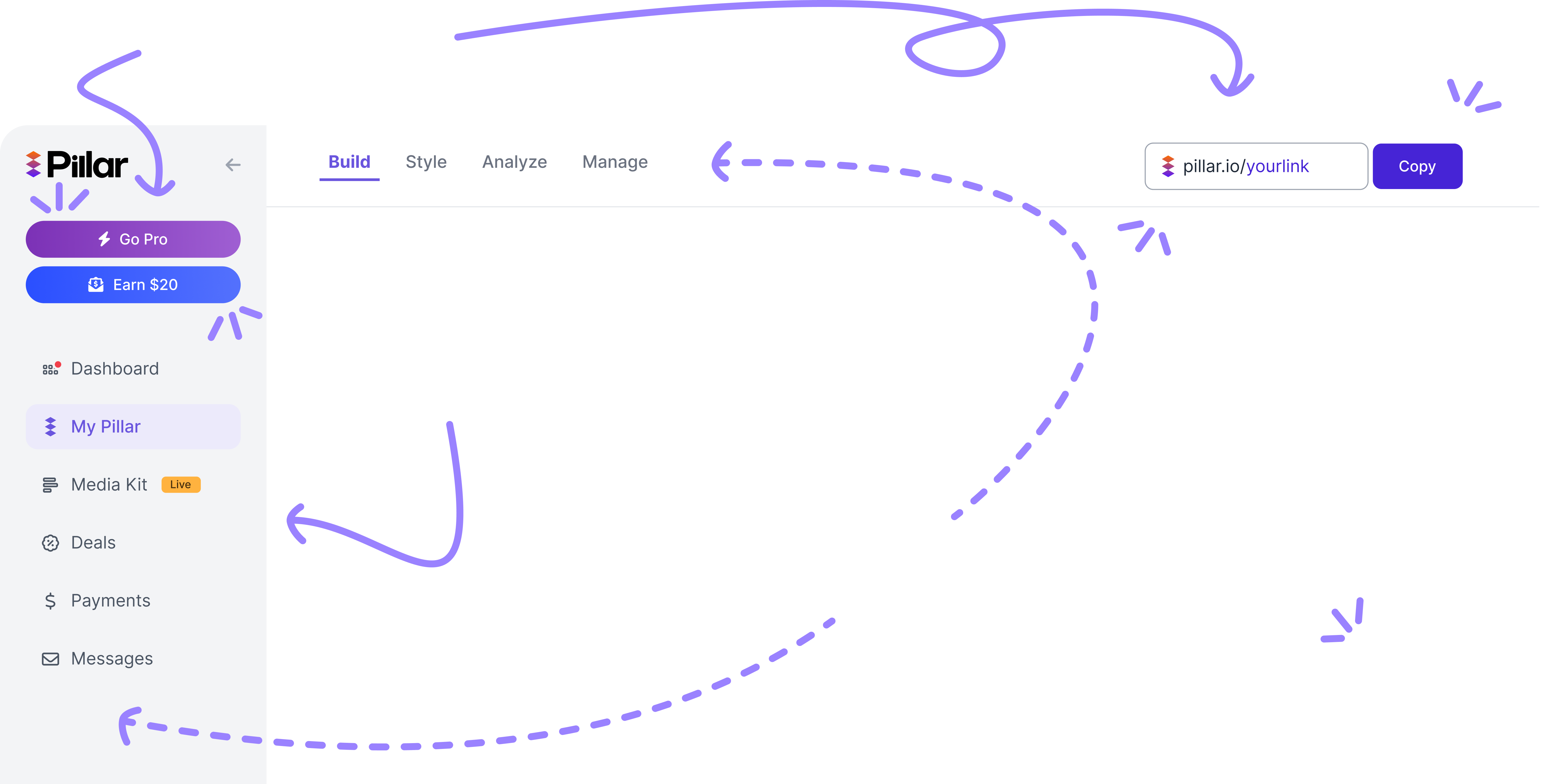
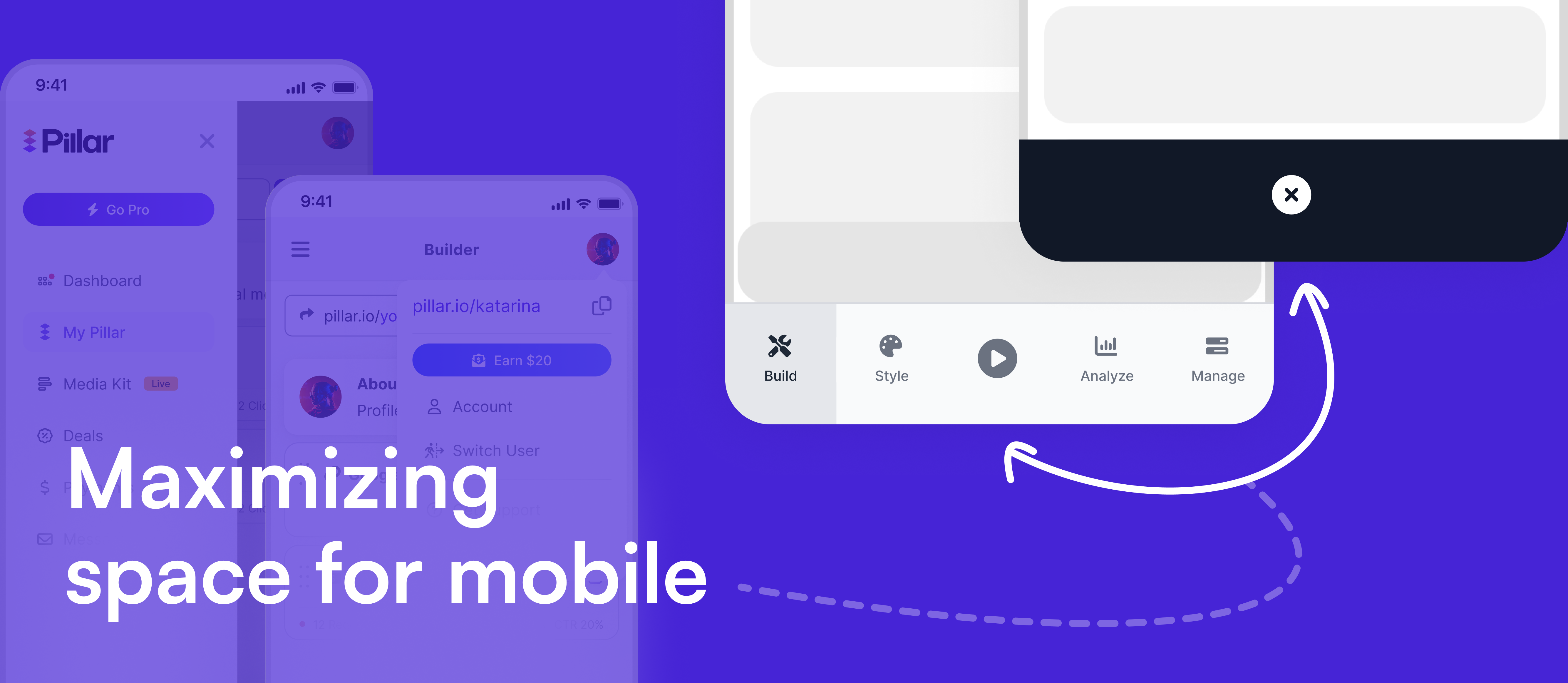
Updating the navigation to a single sidebar with secondary top navigation will increase retention, app activity across more product areas and reduce confusion about the product. It will also set up Pillar for future product updates.
Improved retention and increased page activity for important product areas. Talking to a variety of users also highlighted that they were able to understand the product better.
I discovered the problem through usage data and power user interviews.
We were also reworking an important product area that didn't fit with the visuals and structure of the current navigation, increasing the priority for this project.
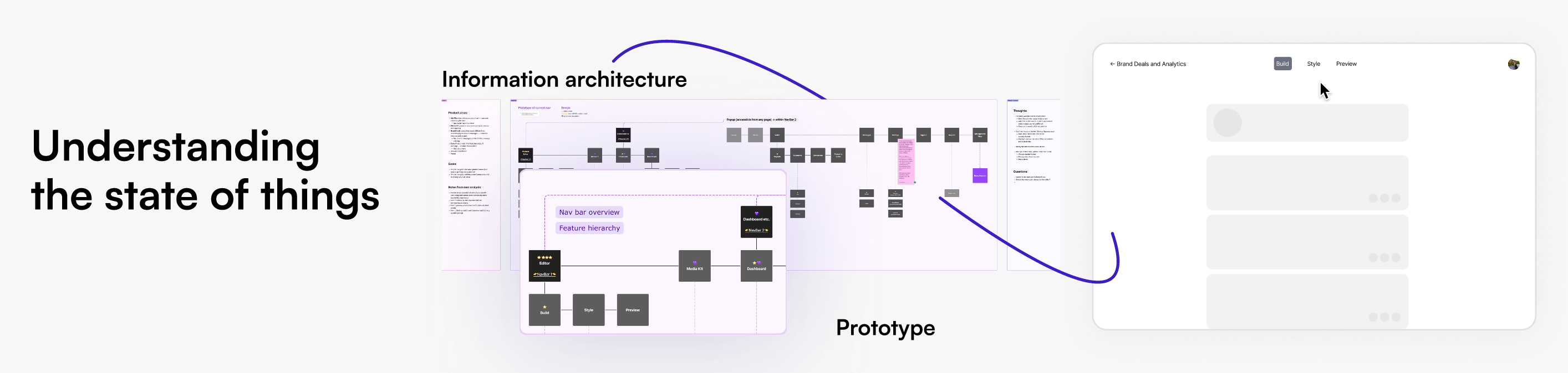
I documented the current navigation through information architecture and a prototype to understand data structures and compare to future iterations.
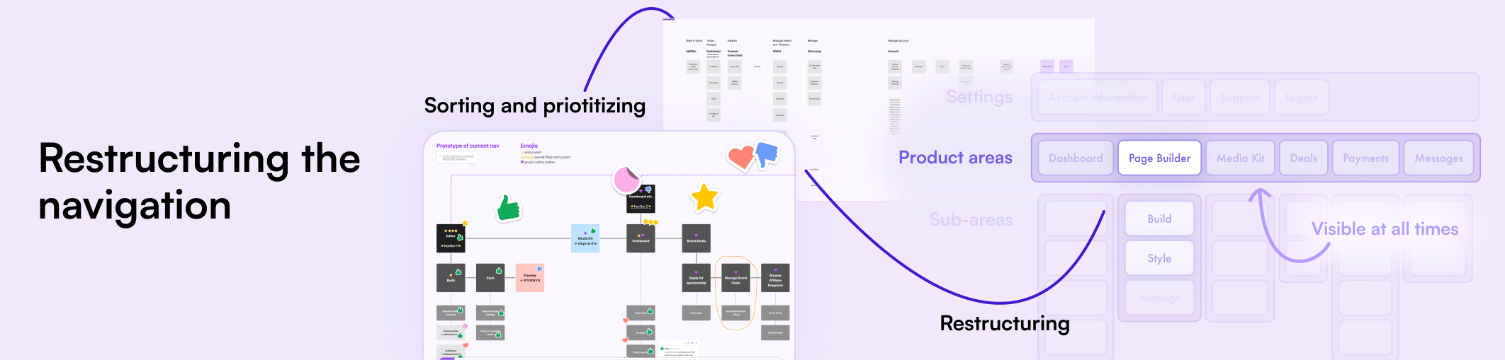
After discussing priorities and the future of the product with stakeholders, I restructured the nav and explored visual structures. Promising iterations were turned into prototypes and discussed with the product and leadership team.
A powerful navigation system that shows all product areas and is scalable for future development of the platform. The final visual design was done by our UI designer as I focused on UX and product thinking at Pillar.
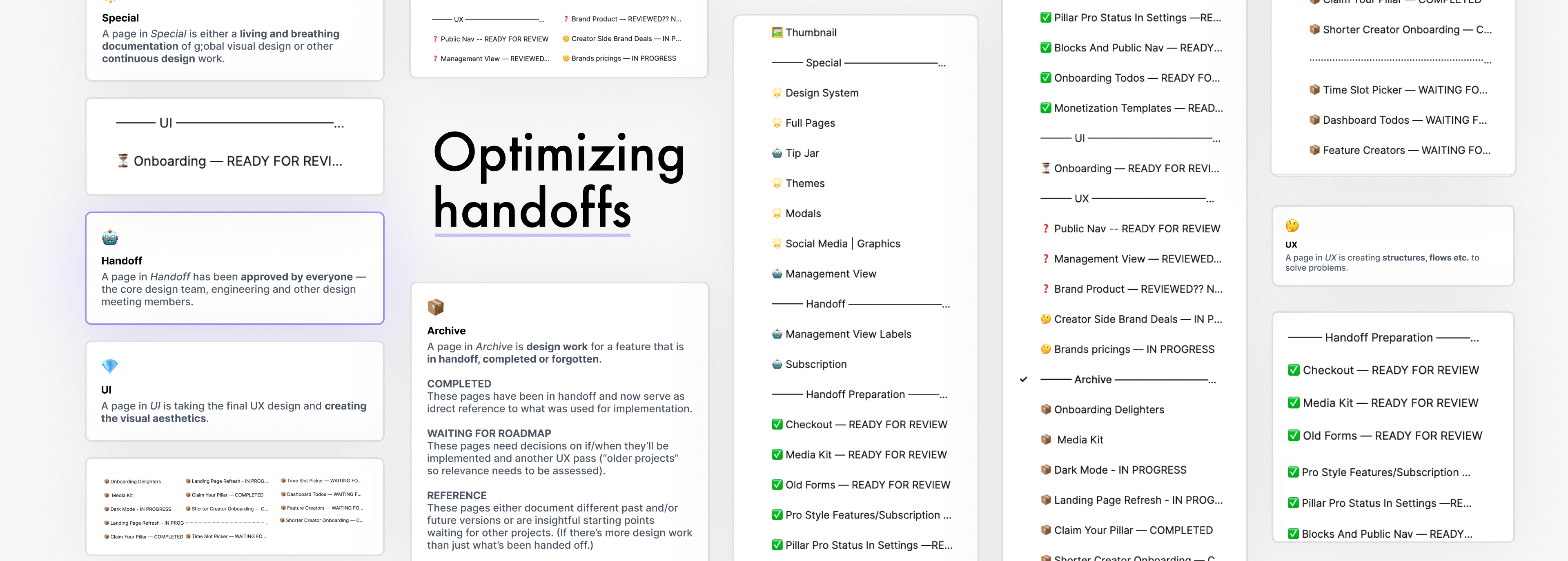
I was responsible not only for handing over wireframes to the UI designer but also for assisting in the UI handoff for implementation. To create a smoother process, I created a new Figma file system with state management that focused on stakeholder usability.
Product understanding and creating adaptable solutions for future developments. Working and communicating within a remote, fast-paced startup environment.