Product design intern at Freeletics
I led design at the wearables team to
launch on-device workout completion.
It increased Apple Watch run workouts by 20%.
Life is hard enough after 400m sprint intervals.

i
Problem
Switching devices to finish the workout doesn't make it easier.
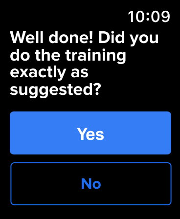
Apple Watch users had to go on their phone to log a session and give workout feedback.
Run workout
Workout
Rate run
Feedback
Cooldown
Next set
Rate cooldown
and log workouts
and log workouts
Feedback
Opportunity
The obvious solution was to bring it all to the watch.
Initially scoped as a straightforward adaptation of the existing mobile flow in collaboration with the PM.
Research
But we need real, sweaty workouts to work it all out.
Sometimes research means hitting the office gym. Besides working out myself, I interviewed people right as they completed their training with wearables, often still out of breath.

i
Key Insight
Physical exertion changes how interactions feel.
Exhaustion, sweat and jittery hands made even simple interactions feel disproportionately hard on a tiny watch screen .
01
High motion
Jittery hands make small buttons and text hard to use right after a set.
02
Low attention
When exhausted, users do not want to spend extra time logging every workout.
03
Small screen
Sweaty fingers make touch unreliable. Dense controls on a tiny screen break flow.
Reframe
So wearables should create their own interactions, not copy phones.
The feedback flow had to be redesigned for a form factor used while fatigued, moving, and low on attention.
Solution
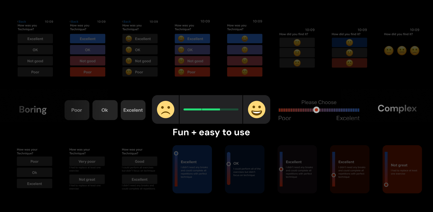
Bringing moments of joy to a repetitive flow.
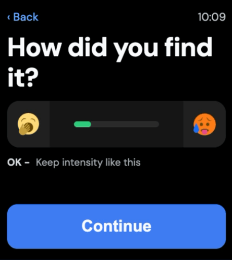
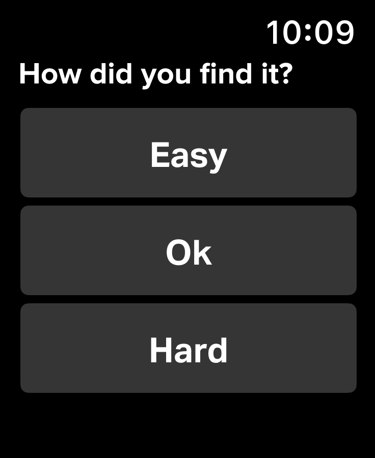
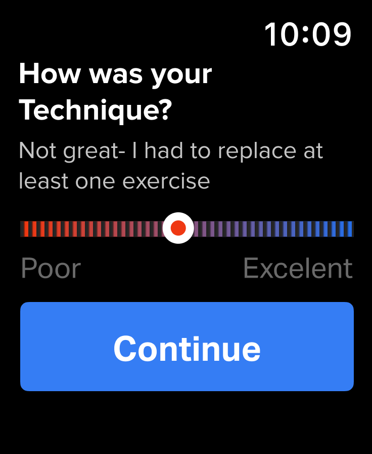
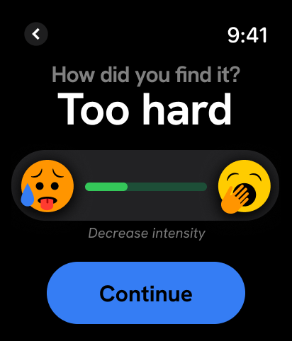
I cut the happy path down to just three taps, replaced text-heavy choices with emojis and enlarged inputs and used crown rotation as input.
Exertion
Easily tappable and fast to understand
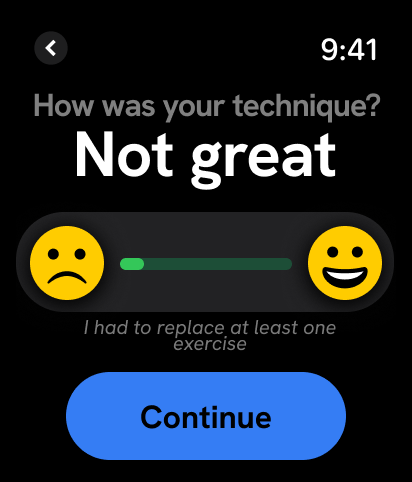
Technique
Like exertion, enough text space for localization
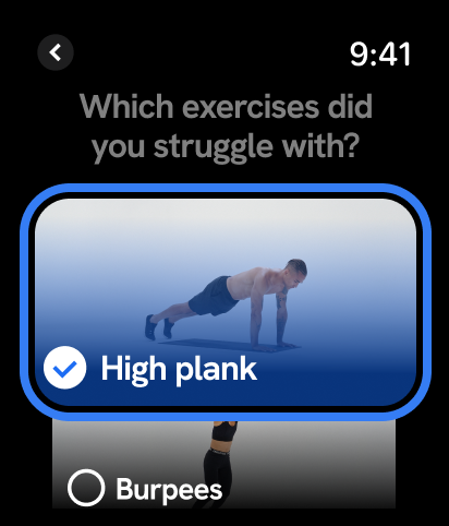
Exercises
Visual reminder to name struggles
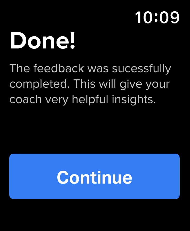
Completion
No-tap, simple and delightful end

Before
After
Implementation
While making sure it could actually be built.
Embedded with engineering, I worked through feasibility and interaction tradeoffs to refine patterns like crown rotation, motion, and feedback states.
Drag, tap, or crown input.

Impact
The redesign improved both usability and retention.
Run engagement
↑20%
Interaction steps
↓90%
↑
Apple Watch retention among active runners
What I learned:
Real-world context is everything in wearables interaction design.