Katarina Blind

Listify

This project was part of a digital design class group project that combined UX design and data structures.

Time

6 weeks (Nov - Dec 2021)

Team

2 other design students, me

Tools

Figma, Famer, Miro/FigJam

Role

Group lead, IC in all design parts, implementation preparation

Pillar Onboarding

Time frame: 6 weeks (Nov - Dec 2021)

Team: 2 other design students, me

Tools: Figma, Famer, Miro/FigJam

Responsibilities: Group lead, IC in all design parts, implementation preparation

Problem

In families with middle aged parents and adolescent children, grocery shopping is often limited to one parent. This creates workload imbalances.

Additionally, as adolescent children grow up they want to increase their level of decision making and voice their own opinions and tastes.
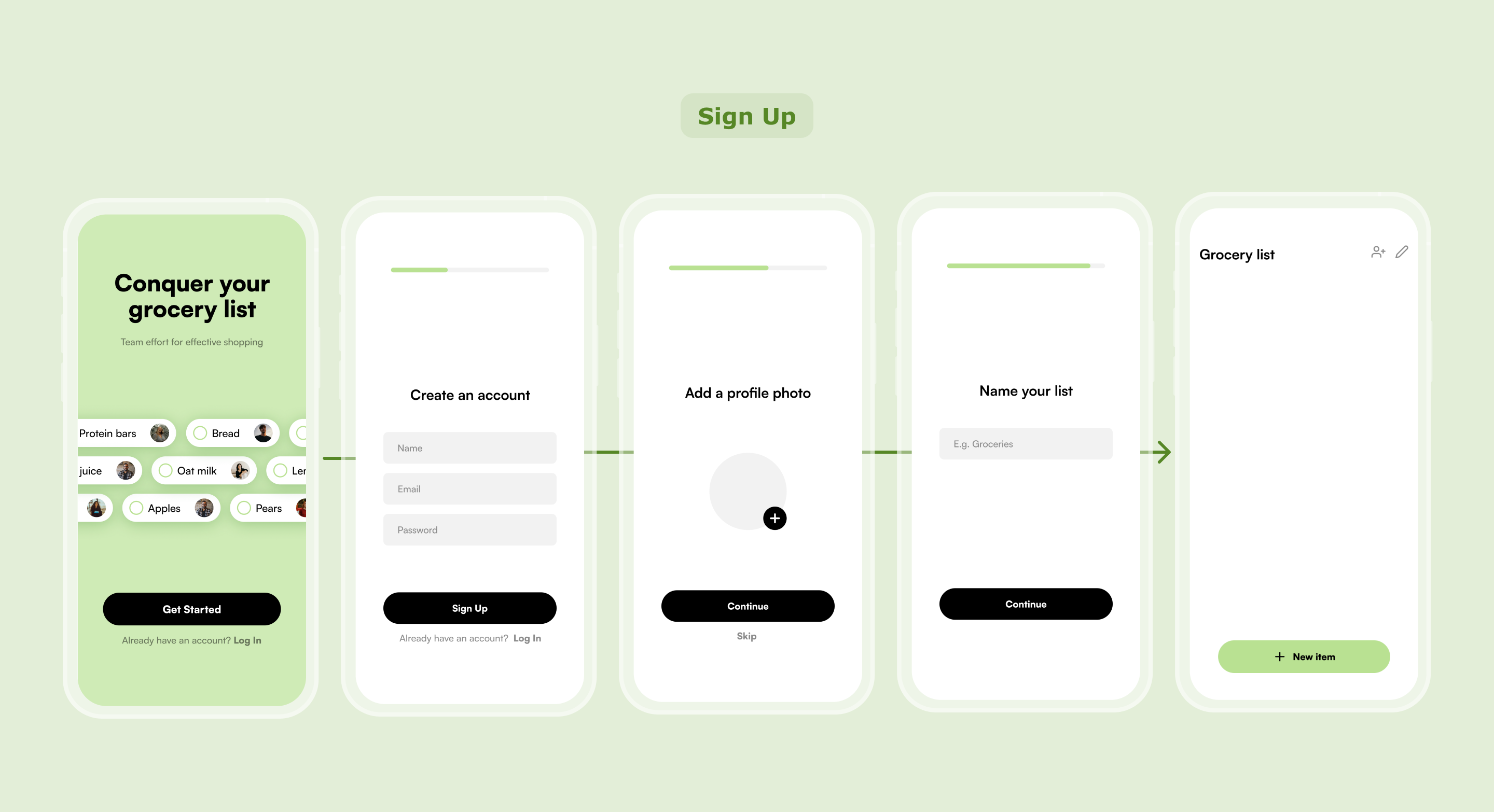
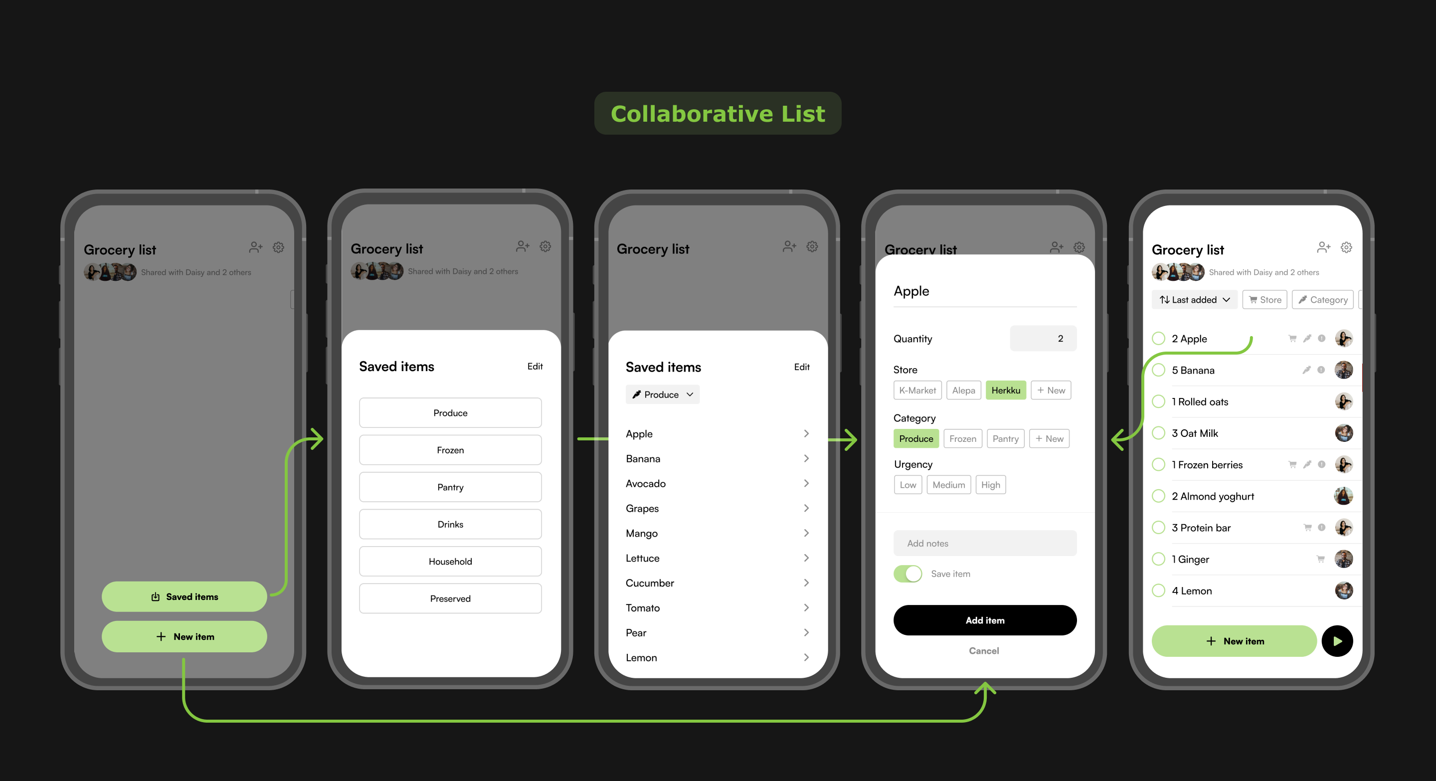
Solution

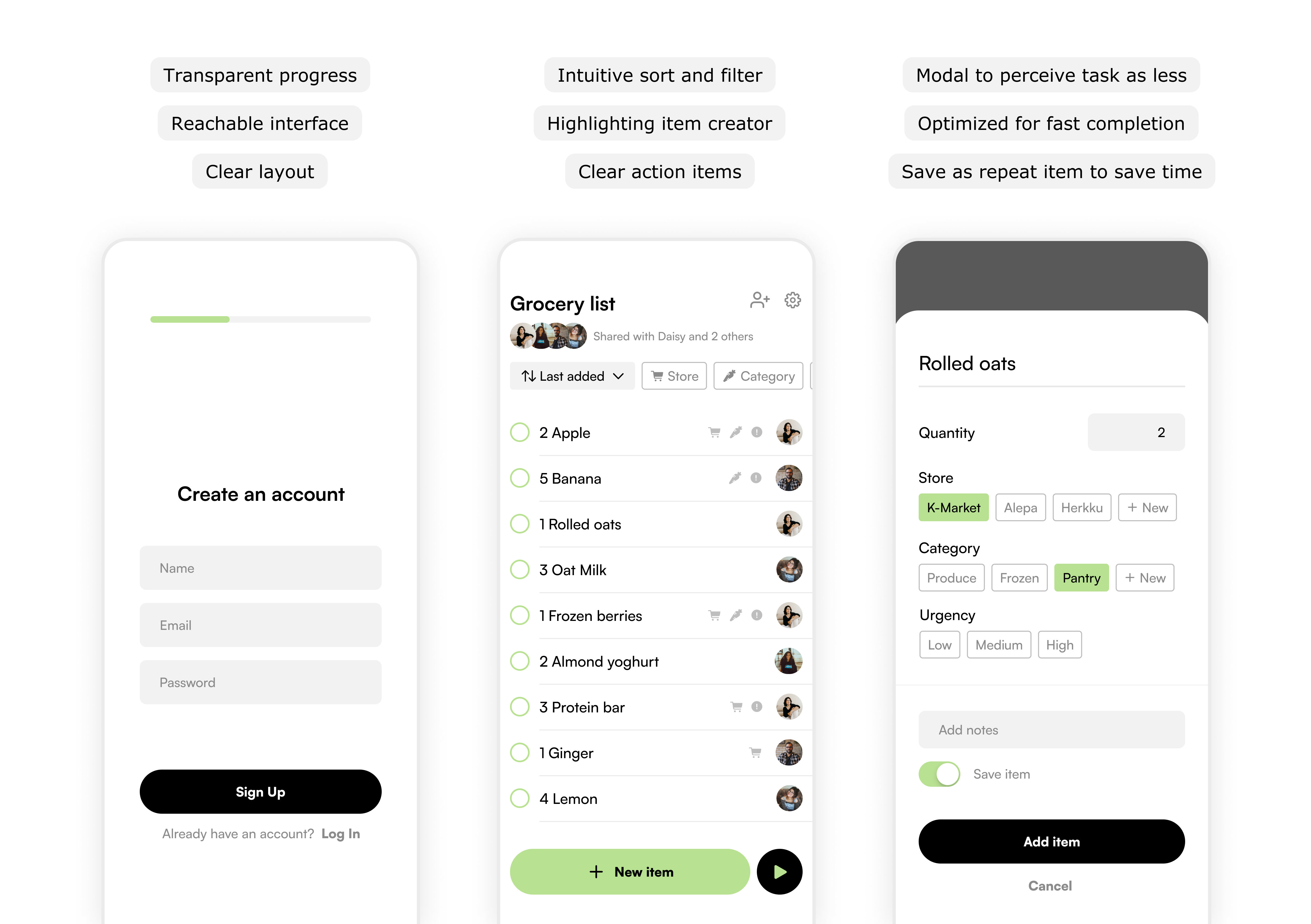
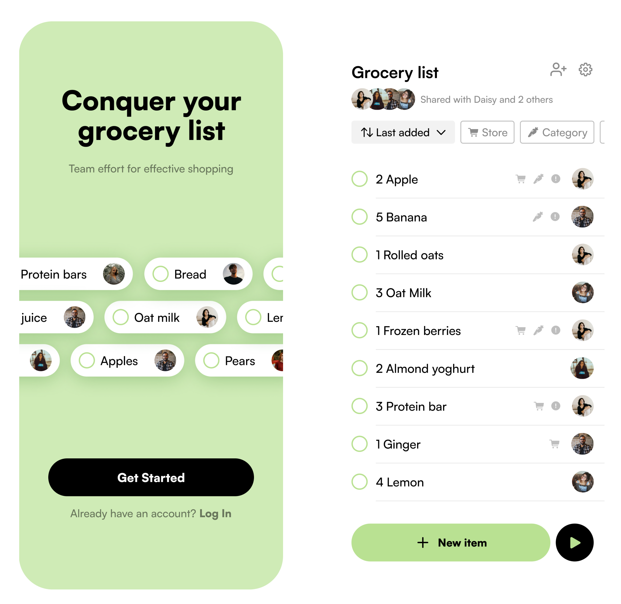
Listify is a truly collaborative shopping list app. It's an interactive Framer prototype with additional code to enable custom inputs.

Measuring success

Qualitative testing can help understand better if the flow is intuitive and if it removes friction from sharing processes.

If the designs were to be implemented, especially focusing on sharing activity (# of list shares, % of invitees joining, …) and list activity (% of list members interacting with list) could help understand if the main functionalities are utilized.

Key learnings
  • Accessible designs: visuals, intuitive experiences

  • Data structures: understanding the underlying framework needed to make the design work

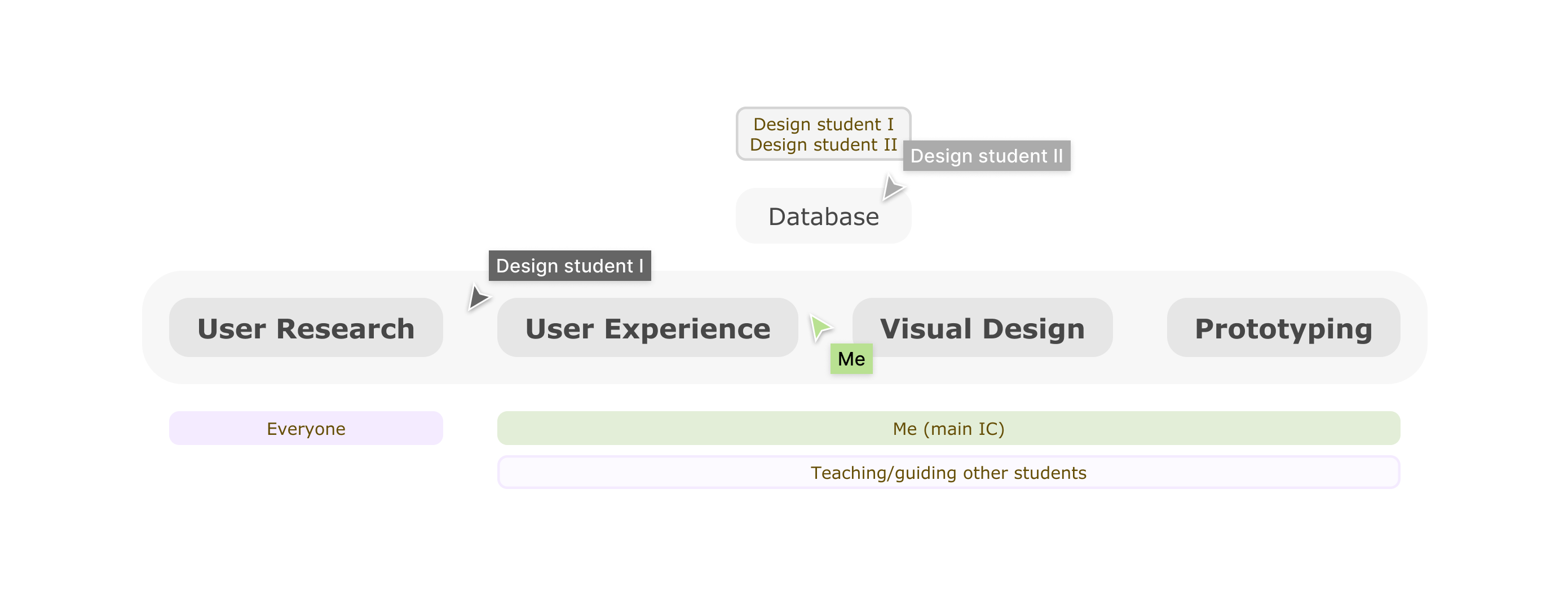
  • Leading project: project planning; teaching my team members how to approach product design

Research

I guided the evaluation of different possible user groups for a clearer direction. Middle aged parents with adolescent children were the most promising as they had multiple active users (instead of e.g. young families).

We then conducted in-depth user interviews of the target user group. The goal was to understand the role of grocery shopping, shopping lists and technology in their lives to get more context and insights into user problems.

Key insights
  • Flawed collaboration: not everyone is involved in planning and doing the groceries, creating a workload imbalance

  • Hectic grocery shopping environments: challenge of using an app in a store and navigating to the right sections

  • Regular and unique grocery items: managing the repeat items like any other creates annoying manual work

We decided to focus on the planning instead of the in-store experience and saw the most potential in collaboration as it tackled a complex, multi-person problem.

User flow

To build the course-required php database, we needed to understand the data structure and scope which we wanted to limit because of our non-technical backgrounds. This was quite a challenge since collaborations requires many data sets and complex connections.

I then started to visualize the flow keeping it simple and familiar with well-known design patterns (e.g. list view, stacked profile images, …). Due to the tight schedule, I wasn't able to explore a lot.

I documented implementation questions and design considerations to discuss with the team.

To keep the scope small, we for example didn't design the email and app onboarding experience for invitees. But even though we limited the scope, we kept track of out-of-scope problem spaces and opportunities.

Refinement

I wanted the visual to enhance the user experience and realized that I had the opportunity to use accessible design to include pretty much every family member as users.

So I researched accessibility guidelines to adjust the sizing, fonts, colors, components and layouts.

Prototyping

By finding a loophole in course requirements I was able to create an interactive Framer prototype instead of having to code the flow from scratch within a week.

So created the flow in Framer, added interactions and used basic open source code to create interactive input fields.

Usability testing

We conducted usability testing with teenagers and middle aged parents where they were given tasks to complete by using the prototype. Everyone had extremely positive feedback, especially on the clear layout, ease of use and well working sharing functionalities.

The testers also voiced some desired features that we'd discussed throughout the project but deliberately excluded to limit the scope.

Further development

This project is a very basic MVP so there still are a lot of opportunities for the future:

  • Perspective of person receiving invitation

  • In-store collaborative shopping experience

  • Repeated purchases

  • Interacting with collaborator's input

Next steps also include finding opportunities for implementation. This would then also allow testing and measuring in-app activity to keep refining the experience.

Refinement

I briefly came back to this project to challenge myself to improve the design while keeping the initial restrictions and foundations. I gave myselft 1 week for each visual design and user experience.

You can read more about this process on here: part 1 (UI) and part 2 (UX).